EasyLaser
UI/UX | Case Study | 2023
Problem
The Company said that users were having some problems to do online schedules and because of that e-commerce's users were abandoning the cart and others users were saying that the product page was confusing.

This Project is a practical exercise with a real client performed inside the course on Design Circuit, with weekly sessions of design critique. All these activities here were carried out individually.
My Contributions
• Desk Research
• Surveys
• Competitor analysis
• Heuristics Analysis
• Journey Map
• User Flow
• Information Architecture
• Wireframe
• HMW's
• Usability Test
• UI design (mobile and desktop)
About EasyLaser
EasyLaser is a company specialized in aesthetic laser treatments. The principal product is laser hair removal and it also offers others treatments.

Today the company is based in Rio de Janeiro, with two units and it also offers options for franchising.
Process
Discover
• Desk Research
• Competitor Analysis
• Survey
• Usability Test
Define
• Heuristics Analysis
• Journey Map
• User Flow
Develop
• Card Sorting
• Wireframe
Deliver
• UI Design
• Usability Test and iterate.
Desk Research
Firstly, I needed to understand what the market was like and how the business of aesthetic treatments works on online media and after that collect the market's data, as well as understand the problems that my client has to faces daily and understand how other players solve the same problems.
Grow up of 13,5% at the sector on the first quarter in 2022
Clients now search for more  PRATICALITY e CONVENIENCE
Search for laser hair removal grow up 22% on 2022
Client's feedback showing the break of in after treatment.
Some highlights collected during Desk Research
Competitor Analysis
After undestant how the market was like, I did a product analysis offer of competitors to undestand how they  se comportavam e ofertavam seus produtos. The goals were: identitify features, fails and processs that can be offer to our product some opportunities.
FAQ avaliable at HOMEPAGE
Details of the procedures
Offer of other products on the page
Treatment specifications
FAQ with all the doubts and explanations about the treatment
Number of visible sessions
Some insights raised during competitor analysis
Survey
Based on the data collected during the analysis, questions were formulated to better understand the hypotheses of friction that users experience when searching for and acquiring laser procedures online.

Number of respondents: 11
Audience: Individuals who have undergone laser treatments or those who haven't but are interested.
Platform: SurveyMonkey
"Fear of burns, irritations, and allergies"
"Lack of information about the treatment"
"Lack of security and delays in acquiring services"
"Delay in communication"
"I DID NOT ACHIEVE THE DESIRED RESULT"
"Lack of availability in the schedule and bugs in applications"
Some responses collected in the survey
Usability Testing
After conducting user research, it was time to identify navigation problems within EASYLASER.
Scenarios were proposed for users to perform within the company's current platform in order to identify flaws and potential improvements.
Results:
• Users are confused by the website's flow.
• They had difficulty finding the desired treatment.
• They emphasized the lack of contraindications.
• They missed the search bar.
• They found the WhatsApp scheduling button to be too hidden.
• The majority of users felt confused.
• They reported difficulties in accessing the service page.
• Difficulty in finding depilation for specific areas.
• They couldn't find a way to purchase combos.
• Inability to purchase individual sessions.
• Difficulties in accessing the prices of services.
• Confusing treatment page.
• Users felt insecure during checkout.
• They missed a purchase review page before finalizing the purchase.
• They found the website slow.

Heuristic Analysis
After usability testing, a MOSCOW prioritization was conducted, followed by an analysis of the company's website to identify heuristic flaws and quantify them on a scale. Simultaneously, another analysis was conducted on one of the leading players in the global market.

- Chosen Clinic: Ever/Body - Voted by industry blogs as having the best atmosphere for clients.Located in Manhattan, NY.The same scenarios used in the usability tests were employed.
- Located in Manhattan, NY.
- The same scenarios used in the usability tests were employed.

After the analysis, possible solutions for the heuristic flaws found on the EasyLaser website were proposed:
Create a page with all the treatments and treatment details.
Standardize buttons and improve hierarchy.
Add a menu option and create a page with all the FAQs instead of just a PDF file.
Standardize section names.
Create a detailed page and only then direct users to checkout.
Automate appointment scheduling.
Some possible solutions for the identified flaws.
Customer Journey
After the heuristics, it was time to identify user friction points during navigation on our product. An actor based on the responses and data collected from interviews and usability tests was created.

Scenario: Paola is bothered by the frequency of waxing and has heard about the results that laser hair removal can provide.

Expectations:
- Find information about each procedure.
- Understand the pros and cons of each procedure.
- Easily find specific procedures.
- Accomplish everything on the website.

Most of the friction points were identified in the second stage, and the following opportunities were noted:
-
Create a search field within the website.
- Implement search filters and segment by body parts.
- Create a page for each procedure.
- Add information and data about the treatment.
- Before-and-after photos.
- Create a shopping cart option.
- Add online booking plugins.
- Revise the flow by offering the purchase after selecting the number of sessions.
- Create a disclaimer for page redirection.
- Automate WhatsApp messages with appointment confirmation and reminders.
- Contraindications field.
- Before-and-after examples for each treatment.
- Offer individual sessions.
- Offer packages on the same page.
Affinity Mapping
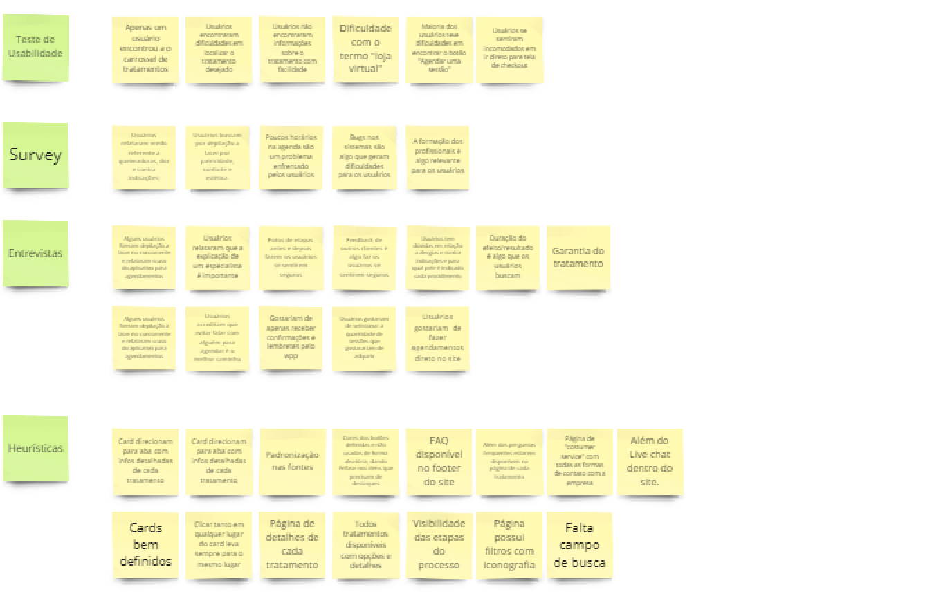
After identifying all the pain points that our users encountered, I needed to gather the information to define possible solutions to the identified problems. Therefore, I grouped all the insights obtained from the applied techniques based on their similarities.
Solutions Found
A new platform with new features was delivered after synthesis and prioritization, offering solutions to all the pain points identified during the discovery stages. It is a clean, responsive, and straightforward platform, providing new opportunities for users, a new flow, and a completely revamped layout while preserving the brand's essence and quality.
Online Scheduling
Why rely on WhatsApp for scheduling your evaluation? A new post-purchase scheduling process was created, where the user chooses and guarantees their evaluation.
Ease of Search
A search field, redesigned navbar, and a categorized product page with filtering options were implemented.
New Categorization
A new categorization created by users who already use online platforms for scheduling sessions in aesthetic treatments and procedures.
Integrated Chat, and More!
Chatbot, user testimonials, promotional tags, shopping cart, best-seller category, option to create combos, and more.
User Flow
After understanding all the problems and collecting all the information, it was time to create a user flow for the website. Some comments from the research were used to aid in the creation of the new flow.
New Categorization
A card sorting was conducted with users to identify similarities in their choices for the proposed new site categorization. After analysis, the following categorization was proposed:
Wireframing
After the new categorization, rounds of Crazy 8's and sketches were developed, and after finalization, medium-fidelity screens were created:
Next, the client's identity was respected, and a color palette that could integrate and harmonize with the company's main color was created. In addition, a new typographic proposal and new visual elements that could compose the layouts were introduced.
Colors
Both characteristic blues of EasyLaser were maintained, with variations created:
Tipography
A new typographic proposal: Montserrat for titles and the Inter font family for texts and captions.
Icons
New icons were designed to facilitate communication with users, some custom-made for the client and others sourced from the Bootstrap library.
Final UI
For the high-fidelity prototype, all screens were developed, and a new round of tests with users was conducted to identify new friction points and propose new solutions.
Click to access the prototypes:
Mobile ProtypeDesktop Prototype
Usability Testing With New Design
Some points raised in the new test: The proposed changes resolved most of the friction points identified in the initial usability test. Other points were raised by users as opportunities for improvement within the new options presented. Users were able to locate all the newly created functions. Users noticed the difference between before and after and recognized the improvement.

Next Steps
Analyze, synthesize, and prioritize the points raised by users in the last usability test conducted and seek to apply the newly acquired knowledge.
Key Learnings
Documenting the process was extremely important for an iterative process, as it allowed me to revisit previous steps and adapt the next ones.
Experimenting with new tools expanded my toolbox and increased their applications.
Consulting documentation for frameworks like Bootstrap, Material Design, and Human-Centered Design facilitated understanding patterns, spacing, and enriched knowledge about UI and design standards.
Thanks ;D